Flex 弹性盒模型
flexFlex 是一种布局方案。相对于传统的布局方式(浮动 + 定位),Flex 布局具有了「弹性」。这也使得在布局时更加的灵活方便了。
01. 使用 Flex
给一个元素加上 display: flex 即可指定使用 flex 布局。
div {
	display: flex;
}

span {
	/* 内联元素使用 inline-flex */
	display: inline-flex;
}
02. 一些概念
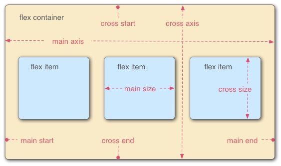
容器:被加上 display: flex 的元素叫做容器。
项目:在 容器 中的元素叫做项目。
主轴(main axis):默认是水平的,从左到右的。见下图 main start 到 main end 。
交叉轴(cross axis):默认是垂直的,从上到下的。见下图 cross start 到 cross end 。
03. 容器选项
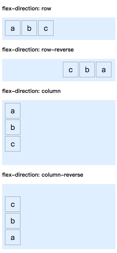
flex-direction: 设置主轴的方向
- row:(默认) 从左到右
- row-reverse:从右到左
- column:从上往下
- column-reverse:从下往上
<!DOCTYPE html>
<html>
	<head>
		<meta charset="utf-8" />
		<style>
			ul {
				display: flex;
				padding: 10px;
				list-style: none;
				background: #e0efff;
			}
			li {
				width: 50px;
				height: 50px;
				font-size: 25px;
				line-height: 50px;
				text-align: center;
				margin-right: 4px;
				margin-bottom: 4px;
				border: 1px solid gray;
			}

			ul:nth-of-type(1) {
				flex-direction: row;
			}
			ul:nth-of-type(2) {
				flex-direction: row-reverse;
			}
			ul:nth-of-type(3) {
				height: 200px;
				flex-direction: column;
			}
			ul:nth-of-type(4) {
				height: 200px;
				flex-direction: column-reverse;
			}
		</style>
	</head>

	<body>
		<h3>flex-direction: row</h3>
		<ul>
			<li>a</li>
			<li>b</li>
			<li>c</li>
		</ul>

		<h3>flex-direction: row-reverse</h3>
		<ul>
			<li>a</li>
			<li>b</li>
			<li>c</li>
		</ul>

		<h3>flex-direction: column</h3>
		<ul>
			<li>a</li>
			<li>b</li>
			<li>c</li>
		</ul>

		<h3>flex-direction: column-reverse</h3>
		<ul>
			<li>a</li>
			<li>b</li>
			<li>c</li>
		</ul>
	</body>
</html>
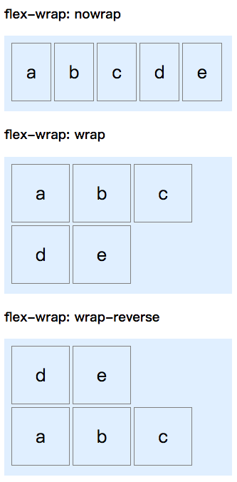
flex-wrap: 设置换行方式
- nowrap:(默认) 不换行
- wrap:换行
- wrap-reverse:换行反向
<!DOCTYPE html>
<html>
	<head>
		<meta charset="utf-8" />
		<style>
			ul {
				width: 300px;
				display: flex;
				padding: 10px;
				list-style: none;
				background: #e0efff;
			}
			li {
				width: 80px;
				height: 80px;
				font-size: 25px;
				line-height: 80px;
				text-align: center;
				margin-right: 4px;
				margin-bottom: 4px;
				border: 1px solid gray;
			}

			ul:nth-of-type(1) {
				flex-wrap: nowrap;
			}
			ul:nth-of-type(2) {
				flex-wrap: wrap;
			}
			ul:nth-of-type(3) {
				flex-wrap: wrap-reverse;
			}
		</style>
	</head>

	<body>
		<h3>flex-wrap: nowrap</h3>
		<ul>
			<li>a</li>
			<li>b</li>
			<li>c</li>
			<li>d</li>
			<li>e</li>
		</ul>

		<h3>flex-wrap: wrap</h3>
		<ul>
			<li>a</li>
			<li>b</li>
			<li>c</li>
			<li>d</li>
			<li>e</li>
		</ul>

		<h3>flex-wrap: wrap-reverse</h3>
		<ul>
			<li>a</li>
			<li>b</li>
			<li>c</li>
			<li>d</li>
			<li>e</li>
		</ul>
	</body>
</html>
flex-flow: 同时设置 flex-direction 与 flex-wrap
- 可被设置的值具体参考
flex-direction与flex-wrap
div {
	flex-flow: <flex-direction> <flex-wrap>;
}
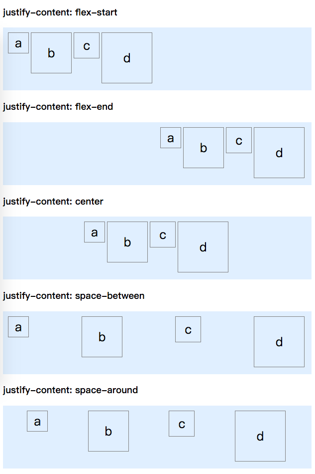
justify-content: 设置项目在主轴上的对齐方式
- flex-start:(默认) 左对齐
- flex-end:右对齐
- center:居中对齐
- space-between:两端对齐
- space-around:每个项目间的间距一致
<!DOCTYPE html>
<html>
	<head>
		<meta charset="utf-8" />
		<style>
			ul {
				width: 600px;
				display: flex;
				padding: 10px;
				list-style: none;
				background: #e0efff;
			}
			li {
				font-size: 25px;
				text-align: center;
				margin-right: 4px;
				margin-bottom: 4px;
				border: 1px solid gray;
			}

			ul:nth-of-type(1) {
				justify-content: flex-start;
			}
			ul:nth-of-type(2) {
				justify-content: flex-end;
			}
			ul:nth-of-type(3) {
				justify-content: center;
			}
			ul:nth-of-type(4) {
				justify-content: space-between;
			}
			ul:nth-of-type(5) {
				justify-content: space-around;
			}

			li:nth-child(1) {
				width: 40px;
				height: 40px;
				line-height: 40px;
			}
			li:nth-child(2) {
				width: 80px;
				height: 80px;
				line-height: 80px;
			}
			li:nth-child(3) {
				width: 50px;
				height: 50px;
				line-height: 50px;
			}
			li:nth-child(4) {
				width: 100px;
				height: 100px;
				line-height: 100px;
			}
		</style>
	</head>

	<body>
		<h3>justify-content: flex-start</h3>
		<ul>
			<li>a</li>
			<li>b</li>
			<li>c</li>
			<li>d</li>
		</ul>

		<h3>justify-content: flex-end</h3>
		<ul>
			<li>a</li>
			<li>b</li>
			<li>c</li>
			<li>d</li>
		</ul>

		<h3>justify-content: center</h3>
		<ul>
			<li>a</li>
			<li>b</li>
			<li>c</li>
			<li>d</li>
		</ul>

		<h3>justify-content: space-between</h3>
		<ul>
			<li>a</li>
			<li>b</li>
			<li>c</li>
			<li>d</li>
		</ul>

		<h3>justify-content: space-around</h3>
		<ul>
			<li>a</li>
			<li>b</li>
			<li>c</li>
			<li>d</li>
		</ul>
	</body>
</html>
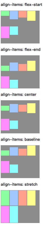
align-items: 设置项目在交叉轴上的对齐方式
- flex-start:沿交叉轴起点对齐
- flex-end:沿交叉轴终点对齐
- center:沿交叉轴中点对齐
- baseline:与项目第一行文字的基线对齐
- stretch:(默认) 未设置高度的项目会沾满整个容器
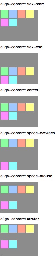
align-content: 设置多行项目时的对齐方式
- flex-start:沿交叉轴起点对齐
- flex-end:沿交叉轴终点对齐
- center:沿交叉轴中点对齐
- space-between:两端对齐
- space-around:平均分配空间
- stretch:(默认) 占满整个交叉轴
04. 项目选项
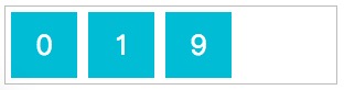
order: 设置项目排列顺序,从小到大,默认为 0
<!DOCTYPE html>
<html>
	<head>
		<meta charset="UTF-8" />
		<style>
			body > div {
				width: 300px;
				display: flex;
				border: 1px solid #bbb;
			}
			div > div {
				color: white;
				margin: 5px;
				width: 60px;
				height: 60px;
				font-size: 25px;
				line-height: 60px;
				text-align: center;
				background: #00bcd4;
			}
			div > div:nth-child(1) {
				order: 1;
			}
			div > div:nth-child(3) {
				order: 9;
			}
		</style>
	</head>
	<body>
		<div>
			<div>1</div>
			<div>0</div>
			<div>9</div>
		</div>
	</body>
</html>
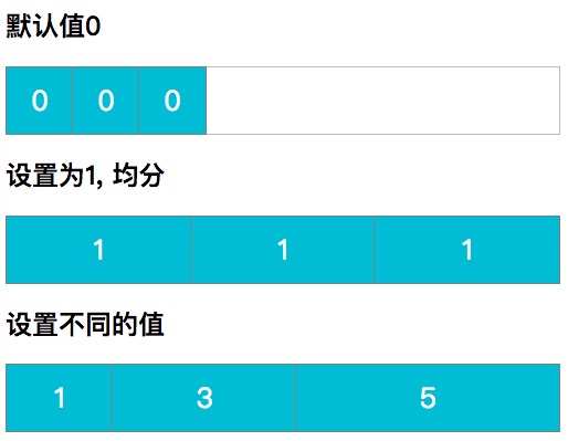
flex-grow: 设置项目放大比例
<!DOCTYPE html>
<html>
	<head>
		<meta charset="UTF-8" />
		<style>
			body > div {
				width: 500px;
				display: flex;
				border: 1px solid #bbb;
			}
			div > div {
				color: white;
				width: 60px;
				height: 60px;
				font-size: 25px;
				line-height: 60px;
				text-align: center;
				background: #00bcd4;
				outline: 1px solid gray;
			}

			#avg > div:nth-child(1) {
				flex-grow: 1;
			}
			#avg > div:nth-child(2) {
				flex-grow: 1;
			}
			#avg > div:nth-child(3) {
				flex-grow: 1;
			}

			#diff > div:nth-child(1) {
				flex-grow: 1;
			}
			#diff > div:nth-child(2) {
				flex-grow: 3;
			}
			#diff > div:nth-child(3) {
				flex-grow: 5;
			}
		</style>
	</head>
	<body>
		<h2>默认值0</h2>
		<div>
			<div>0</div>
			<div>0</div>
			<div>0</div>
		</div>

		<h2>设置为1,均分</h2>
		<div id="avg">
			<div>1</div>
			<div>1</div>
			<div>1</div>
		</div>

		<h2>设置不同的值</h2>
		<div id="diff">
			<div>1</div>
			<div>3</div>
			<div>5</div>
		</div>
	</body>
</html>
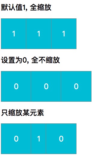
flex-shrink: 设置项目缩小比例
<!DOCTYPE html>
<html>
	<head>
		<meta charset="UTF-8" />
		<style>
			body > div {
				width: 250px;
				display: flex;
				border: 1px solid #bbb;
			}
			div > div {
				color: white;
				width: 100px;
				height: 100px;
				font-size: 25px;
				line-height: 100px;
				text-align: center;
				background: #00bcd4;
				outline: 1px solid gray;
			}

			#zero > div:nth-child(1),
			#zero > div:nth-child(2),
			#zero > div:nth-child(3) {
				flex-shrink: 0;
			}

			#zoom > div:nth-child(1) {
				flex-shrink: 0;
			}
			#zoom > div:nth-child(3) {
				flex-shrink: 0;
			}
		</style>
	</head>
	<body>
		<h2>默认值1,全缩放</h2>
		<div>
			<div>1</div>
			<div>1</div>
			<div>1</div>
		</div>

		<h2>设置为0,全不缩放</h2>
		<div id="zero">
			<div>0</div>
			<div>0</div>
			<div>0</div>
		</div>

		<h2>只缩放某元素</h2>
		<div id="zoom">
			<div>0</div>
			<div>1</div>
			<div>0</div>
		</div>
	</body>
</html>
flex-basis: 设置项目基准值
- auto:(默认) 项目大小
浏览器会根据 flex-basis 计算伸缩比例。若设置为 auto 且未设置 width ,则是项目内内容所占据的宽度。
<!DOCTYPE html>
<html>
	<head>
		<meta charset="UTF-8" />
		<style>
			body > div {
				width: 250px;
				display: flex;
				border: 1px solid #bbb;
			}
			div > div {
				color: white;
				width: 100px;
				height: 100px;
				font-size: 25px;
				line-height: 100px;
				text-align: center;
				background: #00bcd4;
				outline: 1px solid gray;
			}

			div > div:nth-child(2) {
				flex-basis: 500px;
			}
		</style>
	</head>
	<body>
		<div>
			<div>a</div>
			<div>b</div>
			<div>c</div>
		</div>
	</body>
</html>
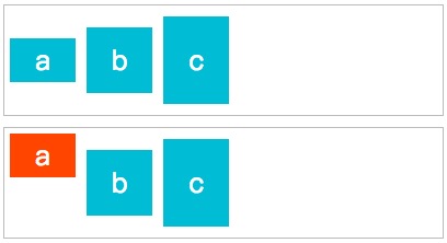
align-self: 为某个项目单独设置 align-items
- auto:(默认) 继承父元素的
align-items属性
<!DOCTYPE html>
<html>
	<head>
		<meta charset="UTF-8" />
		<style>
			body > div {
				width: 400px;
				height: 100px;
				display: flex;
				align-items: center;
				border: 1px solid #bbb;
			}
			div > div {
				color: white;
				margin: 5px;
				width: 60px;
				font-size: 25px;
				text-align: center;
				background: #00bcd4;
			}
			div > div:nth-child(1) {
				height: 40px;
				line-height: 40px;
			}
			div > div:nth-child(2) {
				height: 60px;
				line-height: 60px;
			}
			div > div:nth-child(3) {
				height: 80px;
				line-height: 80px;
			}

			#self {
				margin-top: 10px;
			}
			#self div:nth-child(1) {
				align-self: flex-start;
				background: #ff4500;
			}
		</style>
	</head>
	<body>
		<div>
			<div>a</div>
			<div>b</div>
			<div>c</div>
		</div>

		<div id="self">
			<div>a</div>
			<div>b</div>
			<div>c</div>
		</div>
	</body>
</html>